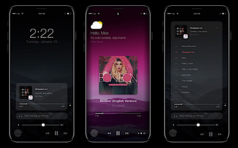
iPhone 8 concept reimagines the home button with a Touch Bar-like interface
The iPhone 8 signifies new possibilities. It’s Apple’s 10th anniversary iPhone, and while we’re not sure what we’re getting just yet, most are in agreement that it’s going to be special — but probably not as special as this concept by Thadeu Brandão.
From the back, Brandão’s iPhone 8 concept looks a lot like the iPhone 7. The front, though, is where the magic happens.
Aside from a gorgeous edge-to-edge screen, the home button seems to be the new point of focus. Rather than serving solely as a navigational tool and fingerprint sensor, the button would take on double duty as the center point of an imaginative new phone interface similar to that of Apple’s Touch Bar on the MacBook Pro.
Like Touch Bar, the system is a dynamic one that changes depending on the application currently in use.
Using the dead space surrounding — and including – the home button, users gain access to additional control options without cluttering up the display. And like Touch Bar, the power rests with the developer to decide what’s important enough to put there.
It’s just a concept, but it’s an undeniably cool one. Mark me down as pro-iPhone Touch Bar.

